Tuesday, June 26, 2018

Imperial Knights WIP, Part I

The new Imperial Knights Codex is out, and I'm using the occasion to finally put paint to the group of Imperial Knights I've been building. I'll post Work In Progress pics here as I go along.

The group I'll be painting consists of three Armiger Warglaives, and one each of the Knight Paladin/Errant, and the Knight Warden/Gallant/Crusader. All of the kits are magnetized to allow any configuration.

One of the reasons I've been putting off painting these awesome figures is indecision over color & heraldry. I wasn't sure if I wanted to make all of them different colors / FreeBlades, or if they should be one Questoris House with a unified color scheme. In the end I chose House Griffith. The White/Navy Blue/Red/Gold color scheme was very regal and bold in appearance, and the primarily off-white / cream color would make for a nice challenge. Example of finished House Griffith Questoris Knights:


After building, magnetizing, and priming all of the kits in polyurethane black, it was on to the airbrush for base colors.

The whole happy family :


I find it's usually best to start coloring with the deepest area and work your way out, finally ending up at the highest/most lighted areas (inside-to-out, bottom-to-top). So the first base colors would be the bare mechanical bits behind the armor plating. For this I chose to do two passes. Chainmail silver over black provided most of the colorization, with built-in shading from generally pointing the airbrush downwards.


Chainmail Silver over all of the bare metal mechanical bitz:


The second pass was the much brighter Steel color, in which I used sparingly over the large, exposed metal bits as a first highlight. This process was fast and smooth, not worrying too much about overspray or details, knowing that a later black oil wash will bring all of the shading together later anyway. For large flat areas (like the chainblade below) the Steel highlight is easier to see.


All finished with the metal. This took about 30 minute for all 5 models and their various arms.


The second color choice to airbrush would be the large off-white areas of armor plating. This also required two passes, but with more precision than the metallics above. On the models, most of the armor plating areas have a nice thick gilded area that acts as a border around armor plating areas. This gave me a useful buffer zone for the airbrush for minor overspray, again avoiding the need for any masking at this point (to me, speed is of the essence at this stage!).


Starting off dark and building up to the lighter areas, the first color choice was Bone White. Using the Renegade Krome at 15-20psi with the Extra Fine tip at various small choke widths as the area required. Laying down a foundation of the Bone color, while leaving a slight shaded gradient area around the gilded border. This was the most thorough/slow step, as the Bone White needs a few layers to appropriately cover the black primer.  It took roughly 1 hour to complete.


The last color choice for this WIP stage was the white armor. For this I used Dead White, putting on thin layers over the Bone white to build up the shading. There are only a few areas that are pure Dead White, most of the layering allows some color through to provide a natural looking gradient.

Here's a comparison of Armiger Warglaives, one with the Dead White highlights, one without. The difference looks subtle in the photo but more striking in person:

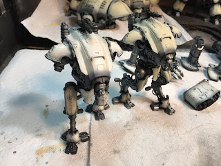

And the finished product for this stage:


All total it took about 2.5 hours to complete this stage, including mixing colors & clearing jams (it was a hot day in the garage).

With a couple of exceptions, the rest of the figures details will be painted with a brush. Thanks for looking!

Monday, June 18, 2018

Roboute and the Ultramarines

The Primarch of the Ultramarines has arrived in the disputed sector to provide the 'Fists with some much needed backup against the Death Guard incursion. I ended up with two Roboute Guilliman models, so decided give this one to my friend Kevin who's been playing Ultramarines since the 80's. I decided to paint them both simultaneously; the other version without the helmet is not pictured here but looks otherwise identical.

The detailed gold gilding on the outer suit of armor was quite an impressive bit of sculpting, and it ended up contrasting well against the dark blue. For expediency, I chose not to use the alcohol-based metal paints, we'll save that for another time (see HB's tutorial on Dante for shading alcohol metals). There's three different values of gold here, which come together bright and shining after being set in the black oil wash. The Hot Flaming Fire Sword of Fiery Flames took on a life of its own, done primarily with several thin airbrush gradient coats, and patience.  I left the detailed base purposely muted and drab in color - the model comes with two flaming torches near the ground, which I left off to keep the color attention on the model itself. Finally, there's a variety of varnishes going on here (hard to tell in the photo), matte for the base and the flames, satin for the armor, and selected gloss for higher points of gold.

Placed next to a squad of filthy Death Guard, Guilliman looks like the golden god he's supposed to be!


Friday, June 8, 2018

I'm dirty, mean and mighty unclean

The Death Guard took it up a notch with the summoning of their Great Unclean One, Big Papi. This is the largest miniature I've ever painted to date, and it was a blast. Truly disgusting to behold. Continuing GW's latest nurgle models, the level of detail on this guy is truly impressive. I especially like the toes.

Most of the figure was airbrushed and highlighted in black and white before any coloring was done, using a couple of layers of Garbage Juice inks with extra green and brown GW Shades (Devlan Mud and Thraka Green). A final oil wash of dark brown sealed the shading together. An (un)healthy dose of red inks layered on top of the buboes gives a highly infectious look. This was my first use of post-wash airbrushing; some green lighting effects on the large rolls of corpulence fat. So girthy! Some final gloss varnish effects on the open wounds and on the ground around his feet - you know Big Papi leaks as he shuffles around the battlefield!

The one thing I would do differently next time - if Big Papi gets a 'Lil Bro - would be to give the skin a more decaying yellowish hue rather than vibrant green, and to give the wounds a more pus-filled, leaking yellow goo appearance instead of the hot red of fresh meat. Yum!


Thursday, April 19, 2018

I Find You in Contempt!

... might not be the most terrifying battle cry, but the Fists' CONTEMPTOR Dreadnought reinforces the battle line just in time. This is as close as the Marines will get to having an ED-209 on the battlefield. The right arm is magnetized for either the Kheres-pattern Assault Cannon or the Multi-Melta. A few new touches on this beast include additional decals - the skull on the right knee, the VII 7th Chapter Imperial Fist legion markings on the shoulders and left knee. Also experimented with colored barrel-burn on the heavy weapons - next time I will do this with an airbrush to get a finer gradient. Finally, some custom letters / wording on the front breastplate banner. Just gibberish really.... or IS IT?

"Please put down your weapon. You have 20 seconds to comply. "


Wednesday, April 18, 2018

Myphitic Blight-Haulers

The arms race continues...... This time, Uncle Nurgle sends forth a trio of adorable and cuddly lil' Daemons: Myphitic Blight-Haulers, a.k.a. Stinky Puppies! Just look at their faces - they seem genuinely happy to see you, and they really want to play! Just be careful or they may leave a smelly surprise in your shoes, or accidentally turn your platoon into goo with their melta-cannon. Here boy! Go get the Astartes! Sick 'em! Gooood boyyyy!

Continuing the overall color scheme of this Death Guard warband, it is tempting to go overboard on the weathering and pestilence effects. But with the white background, less is more - the effects that are there really stand out. The overall ink wash color is something I dub "garbage juice" - parts black, brown, green and yellow ink. Yellow ink is the secret weapon - try some out, a little goes a long way on the final product.